


Logo Best Practices
Maintaining a strong brand identity requires adherence to clear guidelines for usage of the logo. These best practices apply to all of the marks, and will ensure a uniform appearance across internal and external school communications when closely followed.
Adding Words
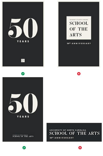
No words may be added to the logo. If the goal is to draw attention to a specific conservatory within UNCSA, the designated logo variation for that school or department should adequately serve the function.
Example of what not to do:
Alignment
To maintain the structure of the logo, the text should always appear left-justified. This will help uphold the intended composition of the logo.
Example of incorrect text alignment:

Background
| Do this: | Not this: |
 |
 |
| Place the logo over a uncluttered background. | Do not place the logo over a cluttered background. |
 |
 |
| Reverse the colors of the logo on a dark background. | Do not place the black version of the logo over a dark background. |
 |
 |
| The unboxed mark should always appear in White or UNCSA Black. | Do not change the unboxed mark to any other color besides White or UNCSA Black. |
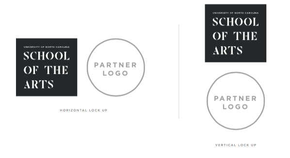
Cobranding
When partnering with external organizations, the marks for UNCSA and the partner organizations should complement one another. The horizontal or stacked logo should appear in UNCSA Black or white, the official colors of the school. When precise color matching is not possible, it is acceptable to us the next closest shade of black and white.
Note: Black and white versions of brand marks create the most cohesive overall design, if sponsors or co-brand partners will allow this usage of their logo.
Horizontal Logo
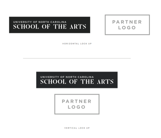
Stacked Logo
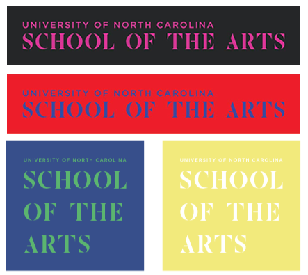
Color
The logo should always appear in UNCSA Black or white, the official colors of the school. Do not change the color of the box or the color of the text in the logo. Additionally, do not add patterns or gradients to the logo.
Why Black and White?
Like a black box theater or the crisp white walls of an art gallery, the UNCSA visual identity brings the work of students and faculty into focus. By presenting a palette void of color, the branding sidesteps existing connotations of colors providing a clean canvas from which to work.
Alternate Solution
When precise color matching is not possible, it is acceptable to use the next closest shade of black and white.
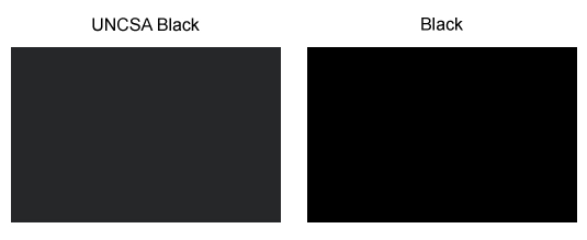
UNCSA Black Color Modes
- PMS 426 C (Pantone color also referred to as spot color; to be used when color consistency is needed across different mediums)
- CMYK C73 / M66 /Y62 / K67 (cyan, magenta, yellow and black used to create print materials)
- RGB R38 / G39 / B41 (red, green and blue used for display of digital images on TV screens, smartphones and computers)
- HEX 252729 (hexadecimal value that is used in websites code)
Example of incorrectly changing logo colors:
UNCSA Complementary Color
Blue (HEX 1796FF) is used sparingly on digital properties as a complementary color to UNCSA black and white.
Cropping
To ensure consistent visual form and recognition, do not distort the shape of the logo or crop the logo.
Example of distorting and cropping logo:
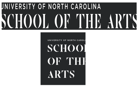
Fonts
The logo typography should never be changed or modified. The logo achieves its aesthetic through custom typography which speaks to the unique spirit of the school. Changing the typography would cause the logo to lose its concept and balance.
Example of incorrect fonts:

Logo used in a sentence
The logo should always appear separate from accompanying text. Blending the logo with copy will not only confuse the reader, but will also crowd the logo.
Example of incorrectly placing the logo and text together:
![]()
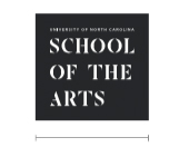
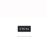
Minimum Size
To maintain full clarity and legibility, the logo must not appear smaller than the minimum size. The minimum size is based on the width of each individual format of the mark. Always scale the logo proportionally.
|
Digital 160 px |
Digital 180 px |
Digital 70 px |

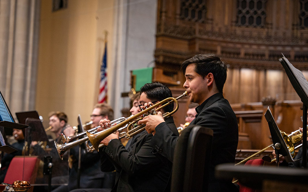
Primary Visual
Avoid making the logo the focus of any collateral. The logo exists to represent the school, but should not appear as the main subject of any school communications. Materials should always focus on the message communicated by UNCSA. The logo should appear in subtle complimentary ways, rather than as the primary subject.
Rotation
The logo should always appear parallel with its surroundings. This will help portray the logo in an official manner and remove the potential for distraction.
Example of rotating the logo. Don't do this:

Shape
Do not modify the surrounding shape of the logo.
Example of incorrect surrounding shape:

Space around logo
Clear space surrounding the logos should be at least equal to the height of the largest “A” in the logo. In order to maximize clarity and legibility, no typography or graphic elements should appear within the designated space surrounding the logo.